
Landing Page Design Tips That Help Increase Conversions
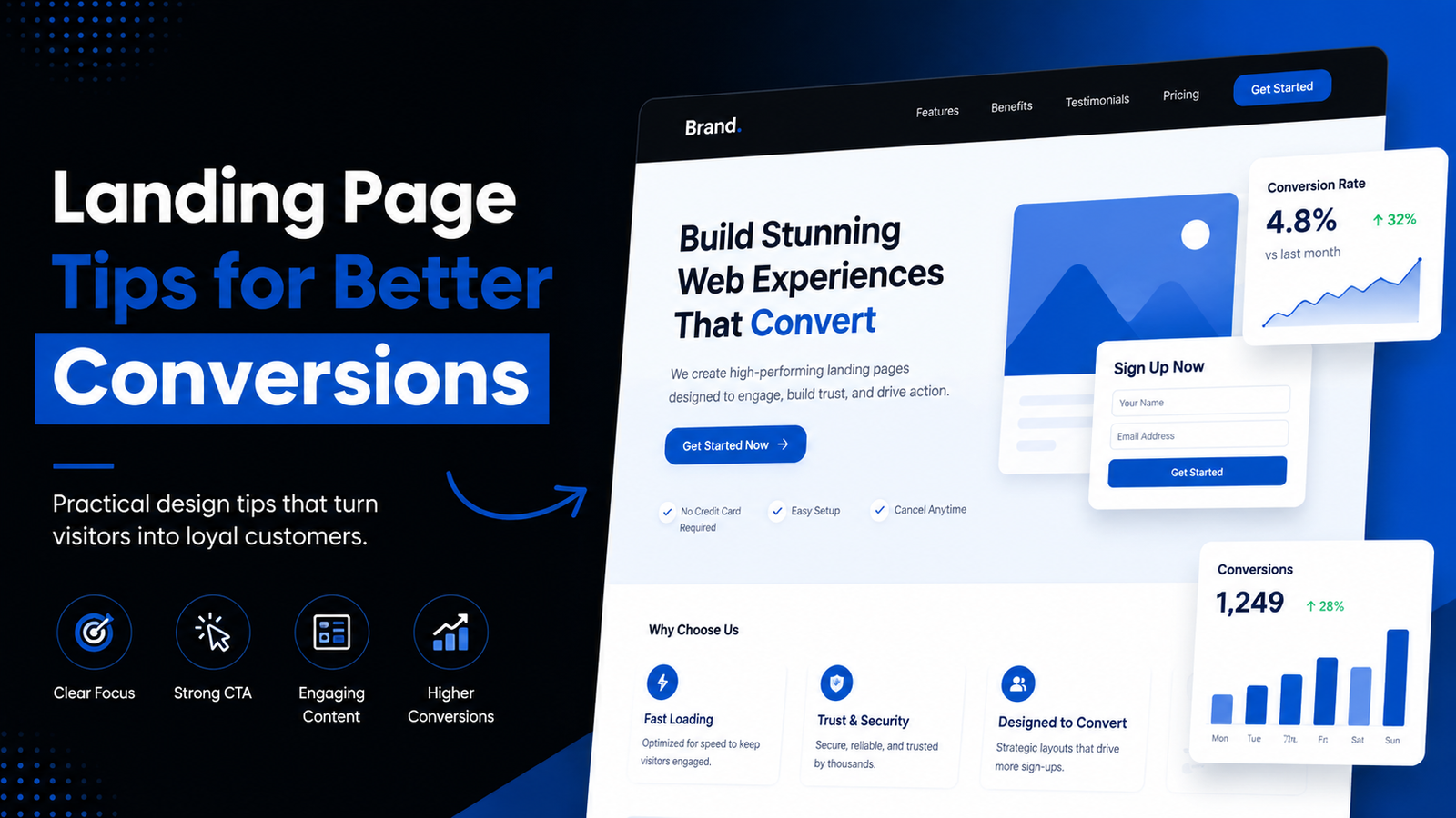
Choosing the right website direction is easier when the advice is practical, honest and connected to real business goals. This guide explains landing page design tips in a way that helps you make a confident decision without relying on vague promises.
What Is a Landing Page?
A landing page is a focused page created for a campaign, offer, service or lead generation goal. Unlike a general homepage, it is designed around one primary action.
Why Landing Page Design Affects Conversions
Design affects how quickly visitors understand the offer, trust the business and decide what to do next. Strong landing page design tips are practical, not decorative.
1. Use One Clear Goal
A landing page should focus on one action. Too many offers, links or buttons can distract visitors from the main conversion.
2. Write a Strong Headline
The headline should make the offer clear quickly. Avoid clever wording if it hides the value.
3. Make the Value Proposition Obvious
Visitors should understand what they get, who it is for and why it matters.
4. Use a Clear Primary CTA
The main button should be visible, specific and repeated naturally where the visitor is ready to act.
5. Build Trust
Use real proof where available, such as portfolio examples, process details, FAQs, contact information or genuine client feedback.
6. Keep the Layout Focused
Remove sections that do not support the page goal. White space, hierarchy and order matter.
7. Use Professional Visual Hierarchy
Headings, subheadings, images and buttons should guide the eye instead of competing for attention.
8. Optimize for Mobile
A landing page must work on small screens. Keep forms simple and buttons easy to tap.
9. Improve Page Speed
Slow pages hurt user experience. Use compressed images and avoid unnecessary scripts.
10. Reduce Form Friction
Ask only for information needed at this stage. Long forms can reduce submissions.
11. Use Social Proof Carefully
Never invent testimonials. If proof is not available, use transparent process explanations or portfolio links instead.
12. Test and Improve
Landing pages improve through review, analytics and user behavior, not guesswork.
Common Landing Page Mistakes
- Too many CTAs.
- Weak headline.
- Slow load time.
- Unclear offer.
- No mobile testing.
- Long form too early.
- Unsupported claims.
Landing Page Conversion Checklist
- One clear goal.
- Strong headline.
- Visible CTA.
- Trust-building content.
- Mobile-friendly layout.
- Fast loading images.
- Simple form.
- Relevant FAQ.
Frequently Asked Questions
What makes a landing page convert better?
A clear offer, focused structure, strong CTA, trust elements, mobile optimization and speed all help.
How long should a landing page be?
It should be as long as needed to answer objections and support the goal, but not longer than necessary.
Do landing pages need navigation menus?
Sometimes minimal navigation is better. Campaign pages often reduce navigation to keep visitors focused.
Should I use testimonials?
Use testimonials only if they are real and permission-based. Do not fabricate social proof.
Can Elementor be used for landing pages?
Yes, Elementor can work well for landing pages when the layout is clean and optimized.
Need a Conversion-Focused Landing Page?
If you need a landing page for a service, product or campaign, review my website services and share your goal.
View Landing Page Service | Discuss a Landing Page
How to Apply Landing Page Design Tips Without Guesswork
The best landing page design tips become useful only when applied to a specific offer. A page for a consultation, a product launch and a webinar should not have the same structure.
Start by writing the action you want visitors to take. Then build the page backward: headline, value proposition, proof, objections, CTA and form. Every section should help that action feel easier.
A landing page does not need to be loud to convert. Often the strongest pages are calm, focused and easy to scan, especially on mobile.
Message Clarity Checklist
- Can visitors understand the offer in five seconds?
- Is the main CTA visible without searching?
- Does the page explain who the offer is for?
- Are the benefits specific rather than vague?
- Does the form ask only necessary questions?
- Are trust elements genuine and relevant?
Design Review Before Launch
Review the page on desktop, tablet and mobile. Check if the headline wraps cleanly, buttons remain visible, forms are easy to use and images do not slow the page.
If the landing page will receive paid traffic, test every link and form before running ads. A broken form or confusing CTA wastes both traffic and budget.
Practical Notes Before You Start
A good website decision should be based on audience, business model, content quality, technical requirements and the way the site will be managed after launch. The design is important, but the structure behind that design is what makes the website useful over time.
For most businesses, the best approach is to start with a clear version-one scope. Build the pages and features that support real customer action first, then improve the website as the business learns from visitor behavior and customer feedback.
Mobile experience deserves special attention. Many visitors will not patiently zoom, pinch or search through crowded layouts. Buttons, forms, menus, product cards, text size and page speed should all be reviewed on real mobile widths before launch.
Content is another common bottleneck. A developer can create the structure, but the business still needs clear service descriptions, product details, policies, images and trust-building information. Preparing these early reduces delays and improves the final result.
What to Prepare Before Contacting a Developer
- A short summary of your business and audience.
- The main goal of the website or page.
- Required pages, features and forms.
- Existing website URL if there is one.
- Brand assets, images and content drafts.
- Reference websites and design preferences.
- Timeline, budget range and support expectations.
How to Review the Finished Work
When the work is ready for review, check more than the homepage. Test navigation, mobile layout, forms, important buttons, page speed, image loading and whether the content can be edited easily.
Ask for a short handover explanation if you will manage the site yourself. Knowing how to update text, images, products or blog posts can save time after launch.
Detailed Planning Guide for This Topic
A strong decision about landing page design tips should begin with discovery. Discovery means understanding the business model, target audience, key services or products, visitor objections, required actions and the type of trust signals the website needs.
The next step is page planning. Even a small website benefits from a clear structure: homepage, about, service or product pages, contact page, policy pages where needed and blog content if search visibility matters. Without structure, design becomes decoration instead of communication.
Content planning should happen before final design. Headings, short paragraphs, benefit statements, FAQs and calls to action shape how users move through a page. If content is weak, even a visually polished design can feel unclear.
Responsive design should be treated as a requirement, not an extra. A layout that looks good on a large monitor can fail on a phone if text is too large, buttons are too close, images crop badly or forms are uncomfortable to complete.
Performance planning is also part of professional website work. Image size, hosting quality, plugin choices, scripts, fonts and animations all affect loading. A premium-looking website should still feel fast and stable.
Basic SEO should be built into the structure. This does not mean keyword stuffing. It means clear URLs, useful headings, descriptive page titles, internal links, helpful content, optimized images and pages that answer the visitor’s real question.
Trust signals must be honest. A website can use process details, portfolio examples, transparent service descriptions, FAQs and contact information without inventing testimonials, awards or unrealistic statistics.
Maintenance should be discussed early. WordPress websites need updates, backups, plugin review and occasional content changes. A site that is easy to maintain is more valuable than a site that only looks impressive during delivery.
Client-Side Questions to Clarify
- What is the main business goal behind this website or page?
- Who is the ideal visitor and what problem are they trying to solve?
- What action should visitors take after reading the page?
- What pages, sections or features are essential for launch?
- What content, brand assets and images are already available?
- Which features can wait until a later improvement phase?
- Who will manage updates after delivery?
- How will success be reviewed after launch?
Developer-Side Quality Checks
A developer should check layout consistency, mobile spacing, button visibility, form behavior, image loading, heading hierarchy and internal links before delivery. These details are easy to miss when a project is judged only by the homepage.
For WordPress projects, the dashboard experience matters too. The owner should be able to update common content without breaking the layout. If a website is difficult to edit, future changes become slower and more expensive.
A professional review also includes plugin discipline. Every plugin should have a purpose. Adding many plugins for small visual effects can make the website harder to maintain and slower over time.
How This Applies to Bangladesh-Based and International Clients
Bangladesh-based businesses often need mobile-first layouts, clear contact options, local delivery or payment explanations, and sometimes bilingual Bangla-English content planning. These should be discussed before design starts.
International clients may care more about remote communication, timezone-friendly updates, documented scope and a smooth review process. The core website quality requirements remain the same: clarity, trust, speed and maintainability.
Whether the client is local or international, the website should not depend on unsupported claims. Clear service descriptions and useful content usually build stronger trust than exaggerated promises.
Common Review Mistakes
- Reviewing only desktop design and ignoring mobile.
- Approving pages before checking forms and buttons.
- Using oversized images because they look sharp on one screen.
- Adding too many animations without considering performance.
- Publishing vague content that does not answer customer questions.
- Ignoring ongoing maintenance and plugin updates.
- Forgetting to add internal links between related pages.
A Practical Next Step
If this topic matches your current website plan, write down your goal, required pages, must-have features and any examples you like. That short brief will make the project conversation more productive.
You can also compare your needs with the current Services page and then send a focused message through the Contact page. A clear first message usually leads to a clearer quote and a smoother project.
Final Pre-Launch Review Checklist
Before publishing any website or major page, review it like a first-time visitor. The page should explain the offer quickly, show the next action clearly and remove avoidable confusion. This review is especially important for business owners who are close to the project and may overlook basic visitor questions.
Also check the operational side. If the website has a form, submit a test message. If it has a store, place a test order. If it has service pages, confirm that the contact links work. A clean launch is not only about design; it is about making sure the website can actually support business conversations.
- Main message is clear above the fold.
- CTA buttons link to the right page.
- Images load clearly without heavy delay.
- Mobile layout is readable and easy to tap.
- Forms, checkout or inquiry paths have been tested.
- Important pages are internally linked.
- Basic SEO title, description and excerpt are prepared.